907
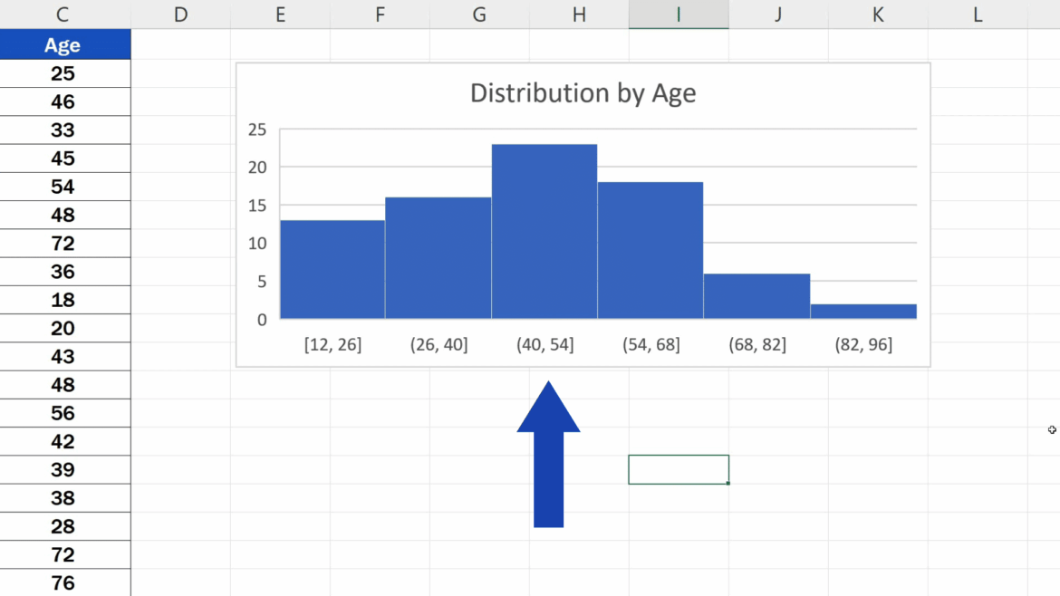
In Excel, you can create clear histograms with equally-sized classes. Excel also automatically calculates the cumulative frequencies for you.
Create histograms in Excel – this is how it’s done
If you want to display a histogram, i.e. a graphical representation of a frequency distribution, in Excel, you just need to follow the instructions below.
- First, activate the analysis functions under “Windows button” ☻ “Excel Options” ☻ “Add-ins” ☻ “Go” ☻ “Analysis Functions”.
- Then enter your (sorted) original list and the upper class limits.
- Then, in the “Data” tab, click on “Data Analysis” (this tool is only available after the analysis functions have been activated; see point 1).
- Then click on “Insert” and then on “Insert statistical diagram” and “Histogram”. Alternatively, you can go to “Recommended Diagrams” via the “All Diagrams” tab.
- Click on the first cell of a new column for the output range and check “Cumulative frequencies” and “Chart view”. Then create the histogram.
Then: Format histogram
Initially, the Excel chart looks like a column chart. Therefore, right-click on a column and open “Format Axis”.
- Select the formatting options you want to use. Example: Select the “Series Options” tab and change the “Gap Width” to “No Gap”.
- Now you can still under “border color” and select a color “Single color line” and in “border style” change the border thickness, for example, in 2pt to be able to distinguish the individual classes.

