633
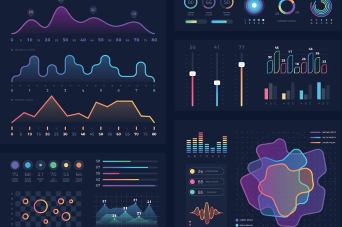
If you want to visualize data, there are various tools available to help you make even large amounts of data easy to understand.
Why data visualization is so important
With the help of a visualization of your data, you can illustrate your work steps and results. This not only helps you, but also others, to gain insights better and faster.
- Through visualization and illustration, large amounts of data become manageable and tangible. You can grasp them at a glance and understand complex relationships more easily.
- You can also recognize trends and patterns in a visualization. Deviating data becomes visible more quickly and does not disappear in texts or tables.
- Simplify your communication through visualization. In particular, people who have not worked with the data as intensively as you can follow you more easily and provide input.
- Visualizing data can also be helpful in the decision-making process. Conclusions can be presented transparently and clearly.
Tools and techniques for visualizing your data
Before you start visualizing, ask yourself what the goal of the visualization is. Is it to compare, analyze, expand or reduce? Your key message can then be highlighted using the right visualization technique.
- A variety of tools are available to help you visualize your data. In addition to spreadsheets or diagrams, various software such as Tableau, Microsoft Power BI or Phyton 3 can be helpful.
- Diagrams and graphics are particularly useful if you want to summarize and visualize numbers. Network diagrams are particularly useful if you want to visualize larger relationships.
- Geographic and spatial data are best processed in the form of maps and distribution views. For example, the Gapminder Foundation uses maps and views to raise awareness of climate protection and sustainability.
- Data in the form of text and language analysis can ideally be visualized in the form of a matrix or a table. Especially with this form of data, it is important that you have already evaluated it in advance. Otherwise, your visualization will be overloaded.
- If you have a large amount of data and different data types, a dashboard is a good option. Here you can explore and analyze your data interactively and dynamically.

