1.1K
Changing the HTML font size is a key step in making web content readable and visually appealing – but getting it right requires more than just superficial adjustments.
Changing HTML font size: methods and fine-tuning
If you want to change the HTML font size, you have a wide range of options. CSS is the tool of choice, but not every technique is equally suitable for every project. Here’s how to put theory into practice:
- Inline styles in the HTML element: Insert the attribute style=“font-size: 18px;” directly in the tag, for example in a p element. This method is quick, but frequent use can lead to confusing code.
- CSS classes in the style block: Define a class such as .text-large { font-size: 1.2rem; } in the head section and assign it using class=“text-large”. Ideal for recurring elements.
- External stylesheets for consistency: Save all font sizes in a separate CSS file and link it using link href=“styles.css” rel=“stylesheet”. This simplifies global changes.
- Use relative units cleverly: Work with rem (relative to the root font size) or em (relative to the parent element). Example: html { font-size: 16px; } sets the base, h1 { font-size: 2rem; } automatically scales headings.
- Check browser compatibility: Test whether units such as vw (viewport width) or ch (character width) work in older browsers. Fallbacks with px or rem prevent display errors.
- Understand specificity in CSS: Avoid conflicts by overriding styles in a targeted manner. A selector such as body p.text { font-size: 1.1rem; } has higher priority than simple classes.
- Control line breaks: The wbr tag allows manual break points, for example for long URLs. Combine it with word-break: break-word or overflow-wrap: anywhere to prevent unsightly overflows.
- Shorten text overflow: Combine text-overflow: ellipsis with white-space: nowrap and overflow: hidden to truncate long texts with “…” – ideal for tables or narrow containers.
- Automatic hyphenation: Enable hyphens: auto in CSS to allow hyphenation depending on the browser. For manual control, use in HTML.
- Non-breaking spaces: Use in HTML code to prevent unwanted breaks – for example, in dates such as “July 10.”
Responsive font sizes: Techniques for dynamic layouts
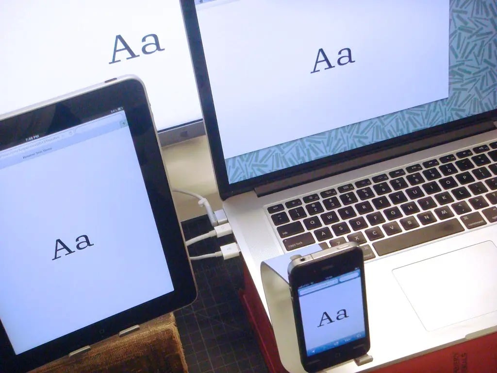
Font sizes that adapt to devices and viewports are not an optional feature, but a requirement. With these strategies, text remains optimally readable on every screen:
- Media queries for clear breakpoints: Define thresholds in CSS such as @media (min-width: 1200px) { .text { font-size: 1.25rem; } } to adjust font sizes for large desktops.
- Fluid typography with clamp(): Use the CSS function clamp(1rem, 2.5vw, 1.5rem) to set minimum, ideal, and maximum font sizes in a line – perfect for smooth transitions.
- Use viewport units selectively: Combine vw with rem to prevent extreme scaling: font-size: calc(1rem + 0.3vw);. This allows the font to grow smoothly with the viewport.
- Adjust root settings: Set the base font size in the html selector to 62.5% to set 1rem to 10px. This simplifies calculations (e.g., 1.6rem = 16px).
- JavaScript for interactive adjustments: Allow users to control font sizes via buttons: document.querySelector(“.text”).style.fontSize = “1.3rem”;
- Prioritize accessibility: Avoid absolute units such as pt or px for main text. Relative units support users who use browser zoom.
- Minimum container widths: Use min-width: fit-content to adjust elements to the text length – this prevents buttons or labels from shrinking to the point of illegibility.
- Consistently implement HTML/CSS separation: Store all styles in external CSS files. Comment code blocks such as /* Typography setup */ – this makes maintenance easier for teams.

